CASE STUDY SPRING 2020
BY: LELA FAND
CLIENT: Professor Deborah Krikun
PROJECT TITLE: Hyper-realism, Cubism, and Type and Motion
HYPER REALISM:
DESCRIPTION:
For the Hyper-realism project we had to create an image that is impossible but looks real. Hyperrealism stems from photorealism, but instead of replicating a photograph realistically, it creates something surreal. We had to find different images as our assets, to compile into one hyper-realist scene.
RESEARCH:
I started by collecting photo assets from google. I made sure to choose large sized images so that the images would be good quality. I wanted to choose a topic having to do with climate change so I gathered images of polar bears, and ice cubes in order to make a hyper-realist scene of polar bears floating on ice cubes (instead of icebergs).
STRATEGY:
I wanted to make sure that all of my images looked good together. I tried to choose images that looked similar or that I thought would look cohesive when I combined them in photoshop. I ended up gathering more images than I ended up using so that I would have several options. It definitely took some trial and error.
CHALLENGES:
I had a number of challenges with this project. For example, I had to combine a sky and ocean from two different images so that it looked the way I wanted. At first, I tried to use one image, but it didn’t fit the whole background. I also had to adjust the brightness and color on some of my images so that they would match each other because it was difficult finding images of polar bears and ice cubes that worked well together. Another challenge was trying to get everything to look like they were actually floating in water. I had to play around with the layer effects to get the bottom halves of the bears and ice to get them to look like they were underwater.
RESULT:

I was really happy with the final result of this project. I thought I did a good job of making this scene look realistic.
CUBISM:
DESCRIPTION:
For the cubism project we had to mimic famous cubism artists and create our own cubist image in photoshop. Cubism combines geometric shapes to create an image. We had to find a cubist artist that we liked and create an image inspired by their work.
RESEARCH:
For this project we had the option of choosing a still life, landscape or portrait to create in the style of cubism. I chose to use photographs of my dog that I took, and compile them to create an image similar to the style of David Hockney’s cubist portraits. I liked the way that Hockney compiled photos of the same subject from different perspectives, so I tried to mimic that in my project.
STRATEGY:
My strategy was to cut out my dogs face into different shapes and combine them into sort of a collage. I also played around with some of the effects that are in photoshop on some of the images. I tried to make it similar to how Hockney did his portraits, while also trying to make it my own. I also wanted to have a palette of blue and orange which are complimentary colors.
CHALLENGES:
In general, a challenge for me was mimicking the cubist style. I am a realistic painter and drawer, so anything abstract is hard for me to create. More specifically, I had trouble with the composition of the project. I found it difficult to find a composition that made sense but was also visually appealing. I ended up bringing my favorite images to the middle of the composition, which I think solved my problem. I also came across the challenge of making the image look less flat, so I had to push some images back by lowering the exposure.
RESULT:

I am happy with how my final cubism project came out, being that this was probably the most challenging project for me.
TYPE AND MOTION:
DESCRIPTION:
For this project, we had to choose a non profit organization, and create a web design and motion graphic for them. We had to create one design for a computer and one variation to fit a mobile phone. The video had to include either a voice over, or type, and have images relating to the organization. It also had to be at least 15 seconds long.
RESEARCH:
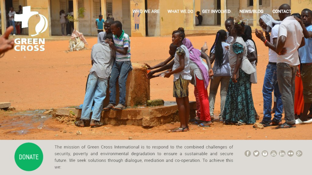
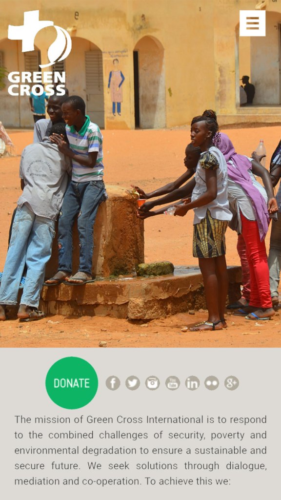
For research, I looked up some organizations and ended up choosing the Green Cross international because I liked what the organization was trying to accomplish. I had to choose the dominant colors of the organization’s website, their mission statement, photos from their website, and a web design layout that we liked, in order to execute the project. I took screenshots of all of the different assets so that I could utilize them in my project.
STRATEGY:
My strategy for this project was to import the image of the web design example that I liked into photoshop and copy the layout using all of my assets. Then I made the same layout, but to fit a mobile phone. For the motion graphic my strategy was to get all of my images and combine them to make a short informational/promotional video for the organization that was both straight to the point and visually pleasing. I decided to use type instead of a voice over because I thought it would be easier for the viewer to absorb the information that way.
CHALLENGES:
I came across the least challenges while working on this project. For the web design aspect I didn’t come across any challenges. For the motion graphic, I came across the challenge of trying to get the timing right for each part of my video. It took some time and trial and error to eventually get all of the times right.
RESULT:
I like how my web design and motion graphic turned out, this project was probably the easiest to accomplish, but still enjoyable.
